MaterialX Learning Website
Educational material and complementary utilities for working with MaterialX.

Main Objectives
This website provides learning materials as well as complementary utilities for working with MaterialX.
The goal when designing this website was to present technical information in a responsive and concise format.
My Role
I was responsible for UX and web design of the project. I oversaw the development of the materials search menu as well as the layout for material sections.
I also conducted user testing for the various versions of the material page layouts.

Designing the Navigation
Navigation Bar
The navigation bar is fixed to the top of the page so that is accessible at any time.
Navbar sections are split into areas such as learning content, reference information, tools, and design rationale. Sections have clickable dropdowns denoted by an downwards arrow to access sub categories.
The togglable sidebar was added to accomdate smaller screen or window sizes when reading about different node definitions. Users can click the sidebar button icon in the navbar to expand/minimize the sidebar.


Material Card Design
Various iterations of the material template card were made before deciding on the current version. Button, table, and container types and orientations were experimented with.
Each node group contains node definitions as collapsible tabs denotated by a downwards arrow.
Each node definitions is within a "card container.
This card container template is used throughout containing:
-
Image preview of material
-
Node graph and ability to copy the node graph to export as an image using the node graph utility
-
Shows attribute values as a series of horizontal fields showing their value or output.
-
Minimal spacing between tabs to improve the viewing experience on smaller screen sizes


Designing the Logo
Various logos were created using the official MaterialX logo as reference. Fonts and colors experimented with were selected for legibility and compatibility with various devices. The final logo shows an example material shown on a sphere using the MaterialX colors.
Creating the Style Guide
A style guide was used to ensure design components were visually consistent across website sections.
Design choices include:
-
Roboto was chosen as the font as it is easily legible on different screen formats and resolutions.
-
Tabs and buttons are blue and rounded in contrast to the plain background. Tabs are distinct and easy to select on devices.
-
Areas are highlighted blue to represent currently selected sections.
-
Standard navigational options through a fixed navigation bar and a sidebar toggle.
-
Maintaining WCAG accessibility guidelines for color contrast between text and background colors.
-
Shown below is the style guide and color accessibility test for this website. The guide outlines commonly used color variations, fonts, components and icons used.


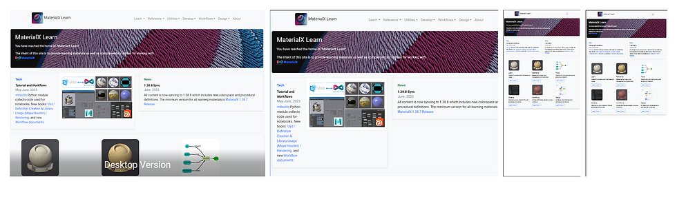
Designing a Responsive Website
The MaterialX Learn website layout resizes depending on the screen size.
At certain breakpoints the navigational menu will collapse into a smaller expandable navigation section.
This makes is easier for users to browse sections on smaller screens such as phones. In addition, content sections also scale down appropriately, collapsing to a single column layout if needed.